
Hello again. I trust that you are fine and dandy.
I am sorry again for lack of visits and replies to your kind comments - I aim to put that right this weekend. Very busy work wise so less time to enjoy myself here sadly.
This week in 'The Land of Custard' (Pat Pending) we are focusing on fonts and old books. Please turn away now if this sounds as anoraky as indeed it is.
I have withheld from posting on this subject in the past as I thought it of little interest and would appeal to a limited number with a specific palette: I know several of those people so we have discussions elsewhere about this very topic! I am coming out here as Annie of Knitsofacto has used a particular font on her blog makeover and I got very excited at the idea!
This post concerns the one subject about which I am very much of the anorak persuasion. I love fabrics, embroidery, tins, china but I LOVE old books - very, very specific books. I have collected these books ALL of my adult life (quite a while then....). I have collected them in a very focused, organised, meticulous way. When it comes to these books I am an anorak..............It has taken some years of blogging to say that!
Another time we will explore the use of the Glasgow Rose motif in Blackie Books and stylistic conventions used by the Blackie Publishing House WITHIN A VERY LIMITED TIME FRAME (I SAID IT WAS ANORAKY!)

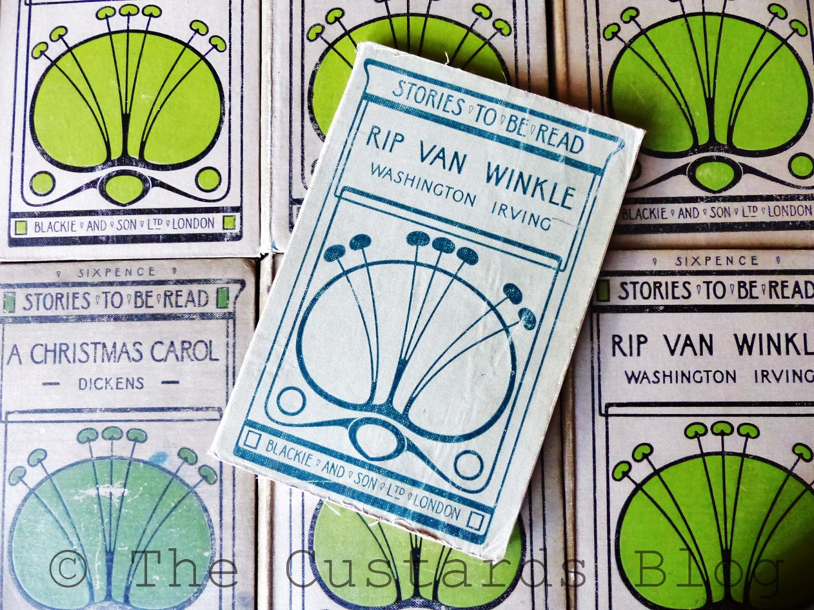
This post explores the fonts used by Talwin Morris and also the designs of Ethel Larcombe : the date range for this post is 1893 to 1915. I WILL NOT be venturing outside of the time scale today so please do not ask : though Talwin's work for Cassell, Morison Brothers and so on is interesting it is NOT the focus for today. I can obviously only touch the surface here as there is a great deal that could be discussed and I have got toilets to clean and beds to make..............
I am joking of course..... but just to say that in these first two photographs we are clearly examining the differences in style between Morris's sans serif font (above) and Larcombe's serif font (below). In my mind both are of equal beauty and I would not put one above the other. Some days sans serif is in favour and on other the serif font wins! Life is like that I find : ying and yang, Rolls & Royce, cheese and biscuits, bra and knickers.
The books above and their specific covers are reasonably uncommon and it took many, many years to finally trace a copy of 'The Handsome Brandons' - other cover designs of same title exist in their plenty but this design is exemplary. It is sheer perfection in the World of Fonts. Dare I say that it is fontastic.....
Ms Larcombe's use of the Glasgow Rose motif will be examined another time - I HAVE TOLD YOU THAT ALREADY.
Two different styles but both with impact on the shelf - which of course was exactly their intention.
That is all the discussion needed for today. I seriously could go on and on but the bare bones will have to do for now.

The books below are all Talwin Morris designs - dating from the 1890s to early 1900 (he had sadly died by 1911). Each and every design is perfect in its balance and form : carefully crafted and delicious upon the book shelf. For this post I have decided to photograph some of Talwin's less common design - some of the longer series you can buy for 2-3 pounds very easily and jolly nice they are too - here though are mainly 'one off' designs.

The joy of Blackie books is that the same title frequently appears in a range of colours....I may have collected one or two over the years.....as seen below.


I have been hoarding collecting the series pictured above since being teenager ('That would be a sad, lonely old teenager would it?'). I would be the early bird at London markets scouring the stalls looking for just these books. I am about half a dozen books away from collecting the last few titles that I am looking for in this particular series. Not sure what I will do after that as I have searched for these books on every overseas trip and bought them in bookshops when visiting New Zealand, Australia, Canada and Eastern Europe among others! This has been 35 odd years in the making and the day I find my last book will be a sad day indeed I think. It is the searching and scouring that is the big adventure and though the internet is a great place it has also spelt the end of my local secondhand book shop . All books that were 'my sort of books' would be kindly be put to one side (some mysterious place out the back) and then the owner would scurry off and say 'I have something that you might like Jenny...'. If I was lucky I would also be invited to play a game of chess with 'The Men' - who would be huddled round an old table in the corner. How wonderful that all was and I could easily loose myself in an old bookshop for a day or two.

The series of books is not tooooo long.....(dare I tell you that this is a 'two book deep' book shelf...and longer than this photograph shows)
I would need a fish eye lens to fit them all it. The series is not uncommon and I think that a fair few of you will be saying: 'I've got some of those'. It is not hard to find the designs of Ethel and Talwin - they were everyday titles published for mass consumption - but finding them in very good condition when they are 100 years old and read by children....ah yes....that can be more difficult. I have been lucky to have found several of this series with their hundred year old dust jackets. A true wonder which, when unpeeled, reveals a 'brand new' book underneath.
The photograph below is pre-wallpapering a few of years ago (I bide my time before I post something!)
.jpg&container=blogger&gadget=a&rewriteMime=image%2F*)
I think that I have mentioned previously that I am rather fond of colour and pattern...The one below is an old Flickr photo of mine. I briefly mentioned my fondness for these books in this post here and before I closed my Flickr account

This is another Larcombe series - NOT RENNIE MACKINTOSH. Comes in a range of colours....I may have others.....


The attention to detail in Talwin's designs is wonderful and the range in styles is staggering (I am only showing a taster here today)


Below is another known Mackintosh design - not as stylised as the previous set of books but use of an interesting font once again. Spookily the two books (far left) were bought at different times, from different book shops but have the same owners name inside.........


Imagine having this book to read as a child - how wondrous that would be. These are little slim books that fit neatly into your pocket. They date from 1903 and are glorious - I will not enter into a debate about that either!

Blackie were experts at marketing so would frequently produce the same book title but in a range of bindings to 'suit all pockets' - reading was for everyone - just as it should be.

These Morris designs m above mainly date from 1897-1899 - some look as though they were printed yesterday. Again keep your eyes peeled as I have bought these books at car boots/charidee shops and all sorts of unexpected places. The world of books is open to anyone I think

The focus here is the Talwin's use of the bird motif in his designs - it crops up time after time...along with fish...

Also available in blue.........oh dear......and green.............and burgundy...... but not for today....another time...

My sisters and I discuss that fact that we had very few books as children - Pear's Cyclopaedia being the main source of reading (lots of facts and figures to memorise and digest). My sister and I learnt all the dates of the Kings and Queens by rote, learnt basic sign language, learnt the meaning of 'umbra and penumbra' (a very handy bit of knowledge if you watch University Challenge) and could draw an image of both at a young age (sad but true!!) - all nuggets gleaned from that book. We had a tattered copy of 'The Waterbabies' that was our grandfathers, a handful of old Beatrix Potters and a hefty copy of the Henry Vlll and his six wives. I still have that book and can find the well thumbed page which I read over and over again as a child : the bit where Anne's extra digit is described. True or false I loved the story. Today we four sisters all have book 'collections' (nothing too grand) - a range of beautiful Alice in Wonderlands (all of us have contributed to that collection every birthday and Christmas - that is where this one here went to) and a lovely collection of Edwardian pictorial covers.
If you wish to build up a collection of anything my top tip is start very, very early in life and buy things that you just love 'because'. I had no idea who designed these books all those years ago - I just thought that they looked nice and would cost 20p to £3.00 so why not! If you are part of a large family you will soon realise that everyone cottons on to your peccadilloes and they will look out for similar things too for you. I wonder if my sister is fed up of Alice's every bloomin' year...
PS: One day will do a separate post on children's book illustrations - I have two or three...cripes
Keep up..
PPS: Wondering if anyone out there thinks that I make all this up and that I really live in an ultra-modern Penthouse just off Mayfair....
PPPPS: Get oudda here - you pesky kids !

PPPPPS: I really do have some anoraky conversations regarding Mr Morris and Ms Larcombe and I am happy so to do
PPPPPPS: Some of my Morris and Ethel books have gone to live on the shelves of the Glasgow School of Art which is most fitting I think
PPPPPPPS: I have far ranging tastes and interests and I am quite sure you do to. I am not alone with my eccentricities!!!
Oh I have bookshelf envy! I was born in Northampton btw - a fact to tide you through the weekend! X
ReplyDeleteWow, Jenny, this is truly fascinating (seriously!) and what a stunning collection. The fonts are amazing but some of the titles sound sound so marvellous such as the "adventures of Mrs wishing to be" and "The Handsome Brandon's". I'd like to ramble amongst our industries too (now that is sad). Have you actually read them?
ReplyDeleteFeel free to do more anoraky posts, I really enjoyed this! They are beautiful books, I wish more modern books had such lovely covers with all the embossing and gilt and the well thought out, balanced designs. I love the font used by Morris, and the designs really have aged so well!
ReplyDeleteJenny, please do sign me up as the First Official Member, or Second after You of course, of the Ethel Landcombe Fan Club. She certainly deserves to be honored. And I shall happily be a new Anorak of Font Design! Thank you, Linda. PS perhaps Ic ould be the First Official American Member?
ReplyDeleteJenny, this post was a complete delight. I think that I will write a thank you note to Annie, for having the post that you commented on that lead to my skipping over to your place right here.
ReplyDeleteI've read through this post rather speedily at the end of a long work day, and will return again to have a longer chance to admire all those books in the photographs, and to absorb some of the designers' names that you mention...most of them were new to me.
Thank you so much. xo
You are definately not alone!
ReplyDeleteI too have bookshelf envy
ReplyDeleteJulie xxxxxxxxx
Oh My....Jenny these are wonderful, the most beautiful of books. You've shown such dedication to you collection, I'm not going to say your an anorak, you are an intelligent, creative collector, of beautiful books! Just lovely m'dear. Have a great weekend, make sure you do something just for you! :) x
ReplyDeleteWho said never judge a book by it's cover? That's my 'type' of anorak... as a cover designer back in the 70's... best post of the year! Happy 2014 xx
ReplyDeleteooh my, Jenny! A few of us will have book envy, with this post!
ReplyDeleteWonderful, wonderful post...
And thank you for sharing...
Hugs maria x
Gulp and drool....I have to come back and read this post a second time as I was initially overwhelmed by the "anorakiness" (sp?) of it all....so much to take in that my brain shut down....lovely indeed.
ReplyDeleteI, too, have a two-deep bookshlf thing going on...glad to hear that I am not the only one....still needing more bookshelves...not looking at the spots above some of the doorways that haven't been utilised....sorry, but NOT a minimalist...
ReplyDeleteGoodness Jenny these book covers are truly beautiful... what a fount of knowledge you are... I especially love the Talwin Morris designs... I do love old interesting books but lacking space usually pass them on as gifts... not sure the recipients are always as thrilled as I would like them to be though. Have a lovely weekend. Cx
ReplyDeleteJenny you really do have such a brilliant eye for design and colour and have obviously been keenly affected from a very young age. Some of us may only get to see one of these beautifully designed books in a lifetime and yet you are positively bedazzled with them. I fear my envy is very poorly disguised and it is such an unattractive trait I know. Please forgive me. Philippa xx
ReplyDeleteA tremendous and, I think, necessary post which is going to be of great interest to lots of people. All the books shown are beautiful and are design classics.
ReplyDeleteI must admit, as a book collector myself, I know what it's like to be a regular customer in certain second-hand bookshops / stalls and hear the owner saying " Oh, i've got something for you " and then seeing them disappear into a back room and then emerging ten minutes later, saying " Sorry about this, but I can't find it. I definitely put it in this pile of books but it's now gone. Just give me another five minutes ! " Oh, and being a valued customer you also get a polystyrene cup of port and a mince pie at Christmas which you consume in front of all the other more lowly customers who look at you enviously ! Haha !
Anyway, thanks again for this post. I shall bookmark it and use it for future reference.
Nick ElfGoblin
gobsmacked!....if only anoraks came in such devine designs! x
ReplyDeleteWow ... what a wonderful collection ... beats my Ladybirds and Observers! M x
ReplyDeleteDear Jenny, I yearn, I burn, I seethe with envy!
ReplyDeleteSo, So beautiful, oh what a perfect collection. It makes me want to scour the land so I can have a shelf (notice how modest I am) of comparable beauty! I LOVED this post, please write more and show more beautiful photos. I have just discovered fonts due to a wonderful book ' Just my type' given to me by a friend. I learning all the time....In awe Jane xxx
Beautiful books with beautiful designs Jenny, I bet you never tire of looking at them what, a super collection - green with envy :)
ReplyDeletex
Wow!!! I have always been a cover snob, never really gave much attention to the fonts. Have you CHANGED that. I know where I will be on Saturday, and looking at the old books with new eyes. Thanks for such great information.
ReplyDeleteblessings, jill
who hopped here from somewhere, and glad I did
Your collection of books is amazing, I love old books too, although I have only a handful, and those are very random. They look so beautiful en masse!
ReplyDeleteoh my absolute goodness *pulls on anorak & spends next few hours sighing over your pics* Lovely to find you noodleBubble X
ReplyDeleteAs you know, because we've emailed, I read this post but didn't comment for lack of time ... it's taken me this long to get back to it, to my shame.
ReplyDeleteI entirely agree ... it's far more likely that Talwin Morris influenced Mackintosh than the other way around. But I'd add that I think Frank Lloyd Wright's early graphic work (mid 1890s) was probably an influence on Morris's later work. That sans serif typeface is so evocative of Wright's emphasis on organic ornament restrained by a mathematical repetition of spatial division. There is a book, Frank Lloyd Wright: Graphic Artist, published about a decade ago now, that might interest you Jenny.
Signed, in envy (all those books!), your fellow anorak, Annie x
Dear Annie
DeleteThank you so much for calling in - to my shame I am only just beginning to reply to comments from a long time ago.
Many years ago Dom and I went travelling around the world - some may have gone to white sandy beaches (we did a bit of that) but we also went to visit great buildings - the work of FLW being one of them in Chicago. Thank you for the tip about the book Annie I will seek that out.
Best wishes
Jenny
What an absolutely stunning collection. I own a book shop in Edinburgh and come across these books a lot and was thinking of starting a Larcombe collection myself . . they are so beautifully designed . . I'd be into joining your club : )
DeletePlease sign me up for your Laura Ethel Larcombe fan club, whom I hold in great esteem.
ReplyDeletewow - such beauty! - thanks for sharing it!
ReplyDelete